Image courtesy of Scryfall.com
Visual Composition and Art Direction Behind Tar Fiend
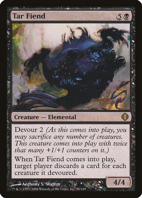
When you crack open a Shards of Alara pack and glimpse Tar Fiend’s card art, you’re not just looking at a creature with a fearsome silhouette—you’re witnessing a study in how color, texture, and momentum converge to tell a story before you even read a single line of rules text 🧙♂️. Anthony S. Waters crafts a composition that instantly communicates the theme of devourment, power, and the shadowy potential of black mana. The piece doesn’t just illustrate a creature; it stages an event worth remembering on the battlefield and in the collector’s binder alike. The art’s dark, viscous environment swallows the edges of the frame, pulling your eye toward the central figure as if tar itself is drawing you closer to the impending effect 🔥.
Tar Fiend’s frame—a classic normal layout from the 2003 era—leans into a dominant center of mass, with the elemental’s bulk anchored by a mass of ooze and smoke. The color palette leans heavily on deep blacks, graphite blues, and hints of crimson heat, a deliberate choice that mirrors the card’s black color identity and the ominous nature of the Devour mechanic ⚔️. The contrast between the glossy, tar-like surface and the more matte surroundings creates a tactile sensation: you can almost smell the resinous scent of burned pitch and the metallic bite of the counter-accumulation mechanic at work. It’s a reminder that magic isn’t just a collection of numbers; it’s a dynamic narrative you carry into every game 🎨.
Design Cues: How the Art Communicates Mechanics
The Devour keyword is not just flavor text; it’s a dynamic architectural principle of Tar Fiend’s presence on the battlefield. Visually, you can read Devour as a countdown—the creature’s stance, the pliant, blobby texture of the tar, and the suggestion of added mass that would come with sac’d creatures. The painting implies transformation: as you commit additional bodies to feed the Fiend, it grows in size and menace. The artist makes this tangible by layering the figure with subtle, rising light from behind, which creates a halo effect around its edges and hints at a core pulsing with earned power 🔥💎. The result is a creature that feels both ancient and dangerous—a deliberate visual metaphor for the way Devour 2 can dramatically alter your play. The discard trigger is depicted more abstractly, yet effectively. Tar Fiend’s looming presence dominates the composition, while the periphery hosts wisps and shadows that resemble fleeting memories—symbolic stand-ins for the cards discarded as the game shifts. This is a smart design choice: you don’t need to read the text to feel the consequence, you sense it in the air around the tar-streaked horizon. The art direction aligns with the set’s broader aesthetic for the shard’s dark, transformative mood, while still staying legible at both standard and high-contrast play surfaces 🧙♂️.
Texture, Light, and the Narrative of Power
Texture is Tar Fiend’s secret weapon. The tar appears viscous and alive, as if it’s just waiting for the moment to close around an expedition into the fate of its enemies. The artist’s brushwork gives you a sense of scale—this is a creature that can swallow a battlefield, not just a single rival. The interplay of light and shadow works like a storyboard: the brightest glints suggest the fiery spark of potential unleashing thickness into the world, while the deepest blacks anchor the room in a sense of foreboding. The result is not merely a card; it’s a mini wall-painting that you’d expect to see in a dimly lit hall of a black mana citadel 🔭.
Lore, Set Context, and Collector Flair
Tar Fiend arrived in Shards of Alara as a rare elemental from the black shard of the multiverse, a block built around five flavors of mana colliding in one world. Its mana cost of five generic and one black (5B) and its rarity signal a mid-to-late-stage pick for both casual play and cube-style drafting. The lore around Tar Fiend is less about a single legend and more about the ecosystem of devourable power—sacrificing your creatures to empower a single, devastating attacker is a classic black strategy, and the art direction reinforces this by portraying a creature that looks ready to consume the board. In the collector’s lane, limited foils and high-res scans show off the subtle gloss on the tar, the fine linework on the creature’s silhouette, and Anthony S. Waters’ skillful depiction that makes the card feel premium even when it’s not in foil 🧙♂️💎.
From a gameplay perspective, Tar Fiend’s presence on the table is often a statement point—how much do you value the board state versus field stability? The art invites you to lean into the chaos: the devour mechanic rewards aggressive play, and the image makes that aggression feel inevitable, not reckless. The rarity and the set’s artisanal production values also help it stand out for collectors who adore the era’s design language—the black-bordered frame, the 2003 frame style, and the painterly approach that Scryfall’s resources preserve for modern viewing and old-school reverence 🎨.
Art Direction Lessons for Modern MTG Design
For aspiring art directors and game designers, Tar Fiend is a case study in purposeful macro- and micro-visual storytelling. The macro-level lesson is clear: align the creature’s silhouette and environment with its mechanical identity. The micro-lesson is in texture and lighting—how tiny bevels of light on a tar-cast surface can convey both sheen and menace, pulling the viewer into a narrative moment. The piece also demonstrates the value of cohesion with the broader set’s color philosophy while preserving a distinct identity for the individual card. The result is a piece that feels both timeless and unmistakably of its era 🧙♂️🔥.
If you’re building a display shelf or an MTG-themed desk setup, Tar Fiend’s art direction offers ideas: a backdrop with dark, reflective textures and a hint of burnished red to echo the card’s energy, a lighting plan that emphasizes the central figure’s mass, and a narrative plaque that explains Devour’s impact in board state terms for new players. It’s not just decoration; it’s an accessible primer on how visual design communicates rules and strategy in a single glance 🎲.
Spotlight on the craft: Great card art doesn’t just decorate a card; it primes the mind for gameplay. Tar Fiend is a masterclass in how texture, color, and composition work together to mirror the card’s mechanical soul.
For fans who want to explore more, you can dive into similar pieces from the Shards of Alara era and compare how the five shards approach elemental life differently in art, typography, and layout. The visual language across the block remains a guide to how art direction can reinforce a game's strategic tempo while honoring the lore’s mood. If you’re ever tempted to own a piece of this design philosophy, consider picking up the foil or non-foil print—each offers its own shimmer and glow, much like a well-timed discard that reshapes a match ⚔️.
On a practical note, for those who are shopping for MTG gear and accessories, a tactile reminder of the game’s art and design power can be found outside the card realm as well. The linked product below is a playful nod to how fans bring MTG aesthetics into everyday life—perfect for a desk mat that echoes the dark, tenacious vibe of the tar-streaked illustration. It’s a small way to celebrate the corners of the multiverse where strategy, story, and style collide 🧙♂️💎.