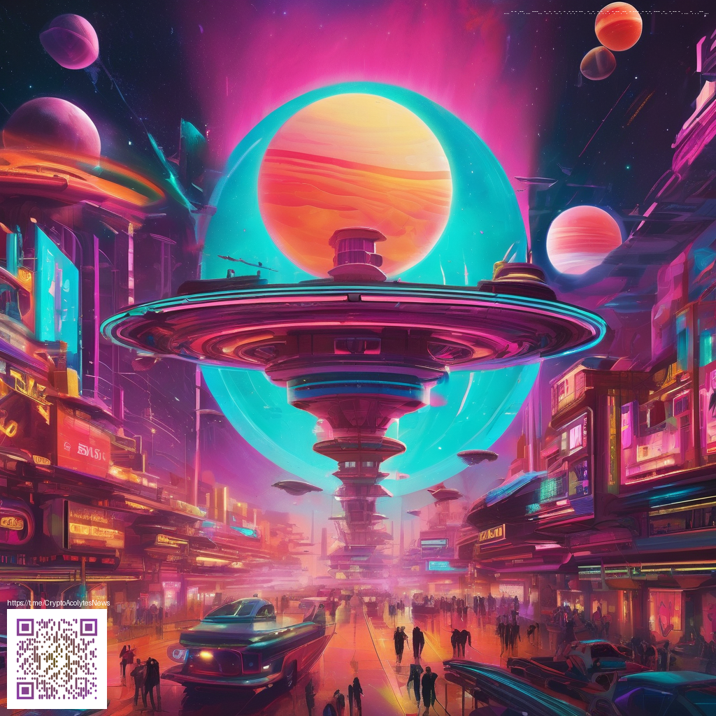
Texture Techniques to Make Flat Illustrations Pop
Flat illustration has its charm: bold shapes, crisp lines, and color blocks that behave beautifully across digital and print. But without texture, even the strongest composition can feel a touch clinical. Texture hints at material, light, and touch—without sacrificing the clean, modern vibe that makes flat art so versatile. In this article, we’ll explore practical techniques you can apply to add texture to flat illustrations, so your designs feel tactile and alive across screens and in print.
Layered shapes and soft edges
Begin by layering shapes with deliberate offsets. Instead of pure, hard silhouettes, introduce subtle shadows and rounded corners. This creates a sense of depth while preserving the flat aesthetic. Quick steps:
- Choose a restrained color palette and introduce slight value shifts (a few percent) between overlapping shapes.
- Apply a gentle blur or feathering on the lower layer to simulate atmosphere without muddying the edges.
- Use crisp lines for the main edges, but let secondary shapes breathe with softer transitions.
Grain and noise for tactile feel
Texture can come from grain or noise that registers at typical viewing scales. Keep texture light and intentionally placed—on background planes, fabric-like surfaces, or metallic hints. Clip the texture so it stays within the intended shapes, preserving overall readability while giving a sense of tactile surface.
Texture is not a distraction; it guides the eye and adds rhythm to the composition.
Pattern overlays without clutter
Patterns can carry personality—tiny halftones, hatch marks, or micro-dot textures. The trick is to apply them as overlays and clip them to certain areas. This approach yields a tactile impression on surfaces like paper, canvas, or plastic, while keeping the primary shapes clean and legible.
Color context and lighting cues
Texture responds to lighting. Subtle highlights along edges and tiny shadows in corners can imply embossed, brushed, or satin finishes. When used thoughtfully, these cues reinforce the texture without overwhelming the flat design language.
For designers who are pairing flat illustrations with physical objects, texture decisions should feel cohesive with the environment. If your concept leans into a neon aesthetic, a coordinated desk setup can support the narrative. The Neon Aesthetic Mouse Pad — Personalized Non-Slip Neoprene Desk Decor offers a vivid counterpoint to bright illustrations. You can view the product page for reference: https://shopify.digital-vault.xyz/products/neon-aesthetic-mouse-pad-personalized-non-slip-neoprene-desk-decor.
On the digital side, gather references from a broader design ecosystem. Resources like the page at https://zero-donate.zero-static.xyz/ccfd70f9.html can spark ideas about how texture interacts with composition, space, and typography. The key is to experiment with small, repeatable textures and test at multiple sizes to ensure readability on mobile devices.
As you practice, remember that texture should enhance the composition’s tactile language, not overwhelm it. Start with a subtle approach, then gradually layer in more complexity if the piece needs it. A single grain pass on a background plane or a careful pattern accent on a focal shape can shift a flat illustration from flat to tactile in a single sweep.
To bring this article into practice, consider starting with a quick texture sprint: pick a simple shape set, test three texture approaches, and compare the results on a phone screen. The workflow becomes faster as you learn which textures hold up under scaling and how they interact with color blocks.
Beyond theory, practical workflow matters. Build a texture library with small samples and test textures against your flat shapes at multiple sizes. Always check legibility on mobile and adjust contrast as needed. If you’re assembling inspiration for a neon-focused concept, resources that connect visuals to physical objects can help—like the product page mentioned above or the inspiration hub at the page linked here.