Image courtesy of Scryfall.com
Collaborations Between Artists and Designers in MTG Card Art
In the Magic: The Gathering multiverse, the art on a card is more than a pretty frame—it’s a cooperative act between visionaries who translate rules into imagery and mood. When you pair a thoughtful designer’s constraints with an artist’s instincts for story, the result can feel inevitable in hindsight: a card that looks like it’s always belonged on the battlefield, perfectly echoing its mechanics. 🧙♂️🔥💎
Take, for example, a blue creature from Time Spiral Timeshifted that still hums with tempo and tension on the board. The collaboration isn’t just about making a ship look cool; it’s about communicating the exact conditions under which it can act, even before you read the first line. That synergy—where the artwork, the flavor, and the rules weave together—defines MTG’s enduring charm. 🎨🎲
Pirate Ship: a case study in blue tempo and island economy
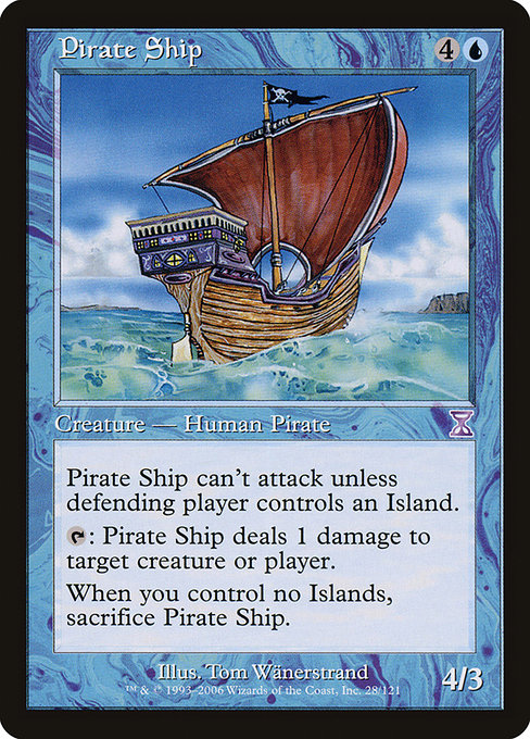
- Name: Pirate Ship
- Set: Time Spiral Timeshifted (tsb), a special rarity reprint subset known for its nostalgia-drenched reprints
- Mana cost: {4}{U}
- Converted mana cost (CMC): 5
- Type: Creature — Human Pirate
- Artist: Tom Wänerstrand
- Rarity: Special
- Power/Toughness: 4/3
- Color identity: Blue
- Legalities (high-level): Modern, Legacy, Vintage, Commander, Duel, OldSchool; generally not standard
- Oracle text: This creature can't attack unless defending player controls an Island. Tap: This creature deals 1 damage to any target. When you control no Islands, sacrifice this creature.
- Prices (as tracked by Scryfall): USD 0.72 (nonfoil), USD 5.47 (foil)
“This ship only dares to ride when the waves themselves obey blue’s command—an island-rich strategy creates a battlefield where tempo becomes a weapon.”
In blue decks, Pirate Ship embodies a classic paradox: cost a valuable turn on the field, but pay for it with precise island management. The rule text ties its aggression to control over the map’s blue isles. If your opponent stumbles and you’ve stabilized with enough Islands, the ship can push through for a decisive ping or two. If, however, your blue mana base starts losing Islands, the ship must walk the plank—sacrifice is the price of overreach. This tension is blue’s essence: calculated risk, and rewards that come from patient, map-making planning. 🧙♂️⚔️
Designing the image to match the mechanism
Tom Wänerstrand’s illustration for Pirate Ship locks in a nautical vibe that signals both freedom and constraint. You see a vessel skirting a shimmering line of islands, its sails catching a wind that seems to bend toward a blue horizon full of opportunity—and danger. The art needed to communicate two truths at once: first, that this ship is ripe for action when islands are plentiful; second, that its swingy, opportunistic nature invites careful timing. The result is a visual cue that guides players before they even study the oracle text. The collaboration here isn’t incidental; it’s a deliberate alignment of form and function. 🎨🧭
Why Timeshifted reprints matter for card art conversations
Time Spiral Timeshifted isn’t just a collection of familiar cards wearing a nostalgic frame. It’s a deliberate design exercise to reintroduce older ideas with a modern sheen, and the “special” rarity tag signals a bridge between eras. For collectors and players, that makes the art a talking point as much as the mechanics. The card’s illustration becomes a touchstone for how designers and artists renegotiate an older concept for contemporary audiences. The collaborative process often means the final art respects the original’s spirit while nudging it toward current play patterns. This is where the “collab” in MTG art truly shines—creative ambition meets practical constraints, and you end up with something that feels both historical and alive. 🔥💎
Gameplay takeaways: building around a blue tempo engine
For anyone who wants to pilot a blue-centric deck with a splashy Time Spiral Timeshifted flavor, Pirate Ship offers a curious route to tempo wins. In practice, you’ll want to anchor the Island count early and use cantrips and counterspells to preserve mana and protect your pressure. The ship’s own ability to ping an opponent or a troublesome creature adds a layer of removal-lite reach that scales as you lean into Island-based play. While the ship won’t carry a game by itself, it contributes to long games where blue control elements slowly corral the battlefield and the island count becomes a resource to manage rather than a constraint to endure. 🧙♂️🎲
- Deckbuilding tip: Pair with cards that ramp or untap Islands to maximize uptime for the ship’s tap ability.
- Shell idea: A primarily blue tempo shell with a few islands-heavy finishers, using Pirate Ship to clip a few early damage while you set up counterplay.
- Foil appeal: If you’re a collector, the foil version’s premium reflects the special rarity and the card’s vintage vibe.
In broader terms, the Pirate Ship is a crisp microcosm of MTG’s art/design collaboration ethos. The artwork and the rules are not separate planets; they orbit around a single strategy: use the planet’s geography to dictate military action. The result is a card that feels as if it could exist in a novel—a vivid character with a precise purpose, living within a carefully drawn map of islands and sea. 🧙♂️⚓
Collector value and cross-promotion notes
As a Time Spiral Timeshifted print, Pirate Ship sits at an interesting intersection of nostalgia and playability. While the nonfoil version sits modestly in many price guides, the foil print carries a noticeable premium, a reflection of its rarity and the appeal of blue battlefield control across formats. For museums of MTG art or casual collectors alike, the card represents a moment when collaboration—between a designer’s constraint and an artist’s flourish—produced something that feels both classic and fresh. If you’re tracking this card for a deck or a display, you’re not just buying a creature; you’re buying a story about how blue’s islands shape the battlefield. 💎🔥
For readers who are curious about a modern way to celebrate the MTG multiverse in everyday life, consider a crossover moment: a stylish phone case that nods to the same sense of design discipline. Speaking of crossovers, there’s a neat way to bring that vibe into real life with a product that blends durable construction with bold color. The Neon Tough Phone Case offers a glossy finish and impact resistance—perfect for fans who want a daily reminder of the voyage from card art to real-world function. 🧙♂️🎨