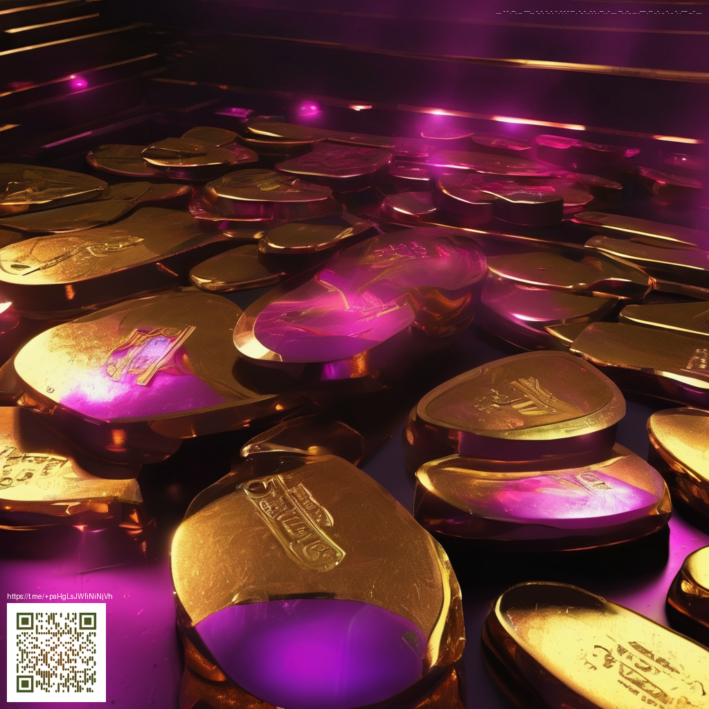
Texture as a Quiet Force in Minimalist Design
In visual minimalism, texture acts as the unsung hero. You can build depth and interest without adding clutter by letting surface feel and material interaction carry the narrative. When light brushes across a surface—whether in a photograph, a product shot, or a user interface—texture becomes a conductor, guiding our gaze and shaping mood with subtle precision.
For a tangible example, consider the Rugged Phone Case with an impact-resistant glossy finish. The glossy texture catches highlights and reveals micro-patterns that imply durability without overwhelming a clean aesthetic. If you’re curious, you can explore this product here: Rugged Phone Case – Impact Resistant Glossy Finish.
When assembling imagery or planning a brand shoot, the textures you select should illustrate texture’s role in grounding minimalism. A tactile surface can become a storytelling device, hinting at grip, weight, or tactility, even as color remains restrained. The gallery approach to texture—where gold-toned surfaces interact with sparse composition—offers a blueprint for balancing detail with clarity. See a representative collection that explores this idea on the Amber Images platform: Amber Images Gallery.
How texture informs perception in minimalist work
Texture influences two core channels: light behavior and sensory interpretation. Matte surfaces diffuse light and communicate calm, understated presence; glossy or metallic textures catch light and reveal highlights, creating focal points that draw the eye without adding extra elements.
- Light interaction: Glossy vs matte textures define contrast and depth while keeping the color palette restrained.
- Tactile cues: Visible textures suggest grip, durability, or luxury, shaping how we imagine touching the object.
- Consistency: Repeating textures across a design creates rhythm and cohesion in a minimalist system.
- Material language: Texture communicates function—soft fabrics for warmth, metal for precision, or a rugged weave for resilience.
“Texture is the quiet argument between material and light, shaping emotion without shouting.”
Practical guidelines for applying texture in minimalist contexts include balancing bold surfaces with generous negative space, and ensuring that texture enhances usability rather than merely decoration. Consider how a single, well-chosen texture can anchor a collection of layouts or product shots, letting the rest of the design breathe.
- Pair one strong texture with broad negative space to maintain balance.
- Favor textures that enhance usability—grip, legibility, or acoustic feel—over surfaces that merely look ornate.
- Let color support texture; neutral palettes often let tactile details shine, while a controlled accent can cue focus.
- Ensure textures read clearly across devices and in print, scaling gracefully from small screens to large displays.
- Evaluate textures under different lighting conditions to understand how highlights and shadows will behave in real life.
In product photography and UI design, texture can act as a visual anchor, letting minimalist compositions feel rich rather than flat. The glossy finish on the Rugged Phone Case demonstrates how a single material choice can convey resilience and function without clutter—an idea designers can translate across platforms and formats.