Texture is often the quiet catalyst behind a compelling digital paper piece. For digital paper artists, the right texture library can transform a flat composition into something with depth, character, and a touch of tactility. The goal isn’t to imitate reality perfectly but to evoke the sensation of traditional media—paper grain, brushwork, or ink on a surface that readers can almost feel with their eyes. This guide explores the best textures to elevate your digital paper art and how to choose, blend, and organize them for a cohesive workflow.
Foundations: how texture informs digital paper art
Textures act as the “sensory bridge” between your digital brushes and the viewer’s perception. A well-chosen texture gives your shapes a grain, weight, and atmosphere that pure vector or flat paint alone cannot achieve. When you layer textures thoughtfully, light and shadow interact with the surface in nuanced ways, letting your colors breathe and your lines breathe with intent. Think of texture as the seasoning in a well-cooked dish—small in amount, but essential for depth.
Core texture categories and how to use them
- Paper grain and fiber textures — simulate laid, cold-press, or rag paper; use sparingly to add depth to backgrounds or letterforms.
- Watercolor washes and pigment granulation — create organic edges and soft blooms that blend with digital strokes.
- Ink, graphite, and charcoal textures — give hand-drawn accents a tactile feel, perfect for outlines and scribbles.
- Fabric textures — linen, canvas, or felt textures add a subtle, tactile warmth to panels and collages.
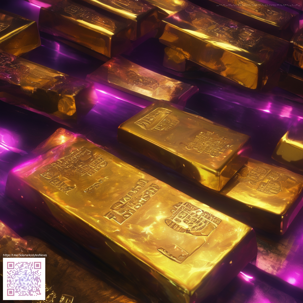
- Metallic foils and foil-like overlays — bring a reflective punch to highlights or decorative elements without overpowering the piece.
- Noise, film grain, and speckle overlays — unify disparate layers and soften overly digital areas for a cohesive look.
- Distressed and torn textures — emulate weathered edges, creative rips, or vintage patinas for a characterful finish.
“Texture should support your composition, not compete with it. When in doubt, scale back and let the subject breathe.”
As you build a library, consider how each texture interacts with color, light, and type. A bright gradient might benefit from a subtle paper texture to prevent it from feeling too flat; a charcoal line art piece might gain presence through a restrained ink texture to mimic pencil on paper. By assembling a palette of textures that complements your preferred subjects, you create a flexible toolkit for consistent, expressive outcomes.
If you’re setting up a comfortable workspace for long, precise sessions, a responsive surface can make a difference. For instance, a reliable desktop accessory like the Neon Gaming Mouse Pad 9x7 Neoprene supports smooth cursor movement and steady hand control during detailed texture work. You can explore this product here: https://shopify.digital-vault.xyz/products/neon-gaming-mouse-pad-9x7-neoprene. It isn’t a texture pack, but a well-designed surface can complement your texture workflows by reducing fatigue and increasing accuracy during layering and blending.
Texture discovery isn’t limited to single packs. A curated gallery of references can spark ideas and help you categorize textures for future projects. A recent collection and exploration page at this texture gallery showcases how artists approach surface treatment, from delicate overlays to bold textures. Let these references inform your own library and inspire new pairings in your work.
Practical workflow: building textures into your project
- Start with a solid base: lay down your main shapes and tones, then decide which texture will carry the surface story.
- Layer textures strategically: keep the strongest texture for the overall surface feel, and use subtler overlays for highlights and focal points.
- Use blending modes and opacity thoughtfully: experiment with multiply, overlay, and soft light to integrate textures without overpowering the composition.
- Keep a texture palette: label and organize textures by category and use-case so you can quickly swap in options as your concept evolves.
- Celebrate edge detail: a restrained torn or grain texture around the margins can frame your subject and add character without distracting from the core message.
In the end, the best textures for digital paper art are those that support your emotional intent. They should feel appropriate to the mood, surface, and era you’re painting into, whether that’s a luminous watercolor vignette or a crisp, modern collage. Embrace experimentation, but also maintain a consistent texture language so viewers recognize your work at a glance.