Image courtesy of Scryfall.com
Un-Cards and Design Theory: Knight of Grace Case Study
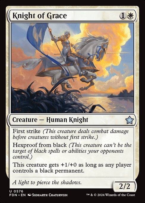
Un-Cards—those quirky, silver-bordered siblings of the MTG family—often function as design laboratories where constraints are pushed, humor is harnessed, and players become co-designers in a sense. But you don’t need a silver-bordered novelty to study their influence. Knight of Grace, a Foundations (FDN) character that looks like a clean white knight on the surface, serves as a surprisingly rich mirror for design theory in the broader MTG canon. 🧙♂️🔥 This two-mana, 2/2 Human Knight with first strike and hexproof from black might feel plain at first glance, but its evolving text—“This creature gets +1/+0 as long as any player controls a black permanent”—creates a subtle, social layer that designers can mine for years. ⚔️
The premise: how Un-Cards inform serious design thinking
Un-Cards aren’t just jokes; they’re experiments in how games manage risk, memory, and player expectation. They show that rules can bend without breaking if the underlying design language remains coherent. Knight of Grace sits at an interesting intersection: it’s plainly designed for competitive play (two mana, 2/2 with strong volatility for combat), yet it invites interpretive play around black’s presence on the battlefield. The card’s buff is not magical or wild—it’s conditional, social, and contingent on an opponent’s deck-building choices. In an era where designers chase new keywords or evergreen archetypes, Knight of Grace embodies a core design discipline: clarity plus enough variability to reward social interaction. 🎲🎨
Knight of Grace: a case study in balance, tempo, and risk
- Tempo engine: With first strike, Knight of Grace can pressure your opponent while trading favorably against many early boards. The advantage compounds when you factor in hexproof from black, which makes it harder for black-based removal to silence the board. The design rewards aggressive playstyles that want to push damage quickly while protecting key pieces. ⚔️
- Hexproof from black: This is not just a vanity ability. Hexproof from black shields Knight of Grace from a broad swath of targeted removal and most pump spells that rely on black mana or black effects. It’s a deliberate white countermeasure that situates Knight as a stubborn front-line protector in creature-based metas. 🛡️
- Dynamic buff condition: The clause “This creature gets +1/+0 as long as any player controls a black permanent” reorients the game state. It quietly nudges players to consider the relative value of black permanents—not just in their own decks but in the table’s ecosystem. The buff is not game-winning by itself, but it tilts the board as soon as black cards are in play, creating a shifting power curve that rewards table awareness. 💎
- Color identity and balance: White is often the color of efficiency, defense, and tempo—Knight of Grace fits neatly into that tradition. The card’s mix of first strike, hexproof, and a modest power/tower edge demonstrates how white’s toolkit can harmonize with blue’s trickiness, red’s aggression, or black’s disruption depending on the broader deck environment. This balance makes Knight a reliable pick in many contexts, even as other cards push into flashier territory. 🧙♂️
Design lessons drawn from the Knight—what Un-Cards can teach mainstream sets
“Constraints, not chaos, unlock creativity.”
From an Un-Card philosophy to a Foundations reprint, Knight of Grace offers several takeaways for designers and players alike:
- Keep interactions legible: The ability combination is clear and synergistic, not tangled in obscure wording. The result is a card that players can understand at a glance, which is essential for both casual play and high-level competition. 🎯
- Balance within constraint: A 2/2 body at {1}{W}, combined with first strike and a defensive aura, would be overbearing in a vacuum. The hexproof from black softens that punch, and the buff condition provides a dynamic edge that only shows up in the right board state. It’s a neat reminder that constraints—cost, stats, and reach—must harmonize with the card’s intended role. 🔧
- Socially aware design: Knight’s buff grows with the presence of black permanents, inviting players to think about the game’s social ecosystem, not just their own deck. It’s a playful nudge toward table dynamics—who’s playing what color, and how is the color spectrum shaping combat. 🔄
- Flavor that informs form: The flavor text “A light to pierce the shadows” pairs with the white knight’s role as a beacon of safety and courage. When design and flavor align, the card feels intentional rather than accidental. 🍃
From theory to practice: reading Knight in a real game
In a multiplayer arena or a standard draft, Knight of Grace can become a stabilizing force in the right white shell. Its first strike keeps it relevant in the early turns, while hexproof from black protects it from some of the most frustrating single-target removals. The conditional buff incentivizes players to consider black’s presence as part of the opponent’s plan—do you enable a powerful black permanent to empower Knight, or do you sweep away threats to neutralize the buff? The answer varies with the table’s mood, and that variance is exactly what makes Un-Card-inspired design thinking so fertile for modern sets. 🧙♂️🔥
Collectors and artists alike will appreciate the card’s art by Sidharth Chaturvedi, a piece that captures the gleam of oath-bound armor and the resolve of a knight facing shadowy forces. The Foundation set’s clean silhouette and straightforward templating demonstrate that strong, memorable design doesn’t always need a flashy keyword—sometimes it’s the quiet interplay of timing, protection, and a single, telling buff that resonates with players across formats. ⚔️🎨
Practical takeaways for builders and fans
- Use clear, social-focused triggers for buffs to encourage table-wide storytelling without overcomplicating the rules.
- Pair solid defensive tools (like hexproof) with tempo elements to create a resilient midrange creature that can swing games late into the match.
- When exploring “Un-Card”-inspired concepts, center the design around core color identities and trusted mechanics—this preserves clarity while still offering room for creative exploration.
Speaking of creative exploration, if you’re looking to protect your devices with equal gusto as Knight protects the skyscape of white control, check this cross-promotional pick: a Neon Tough Phone Case 2-Piece Armor for iPhone Samsung. Because even legends deserve armor off the battlefield. 🧙♂️💎