Designing Paper with Depth for Motion Posters
Motion posters live at the intersection of still imagery and suggested movement. The trick is to imply motion while keeping the work visually legible in a single glance. When you design with depth in mind, every fold, layer, and shadow becomes a cue that suggests motion rather than asking the viewer to imagine it. The result is a tactile, almost kinetic experience that rewards close inspection and then reads cleanly from a distance.
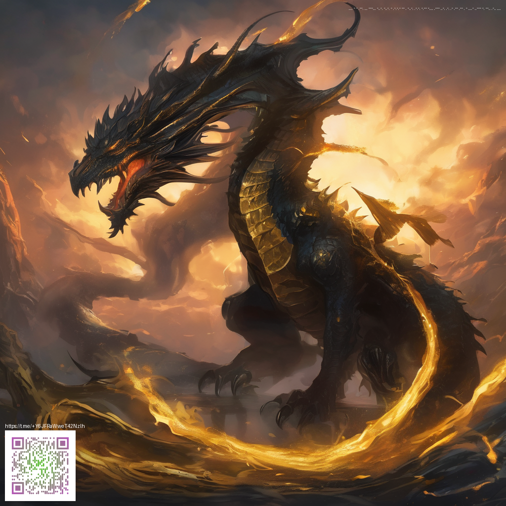
Depth in paper design isn’t about adding more texture for texture’s sake; it’s about orchestrating layers so the eye perceives parallax and hierarchy. Start with a strong foreground statement, then back it up with mid-ground silhouettes and a receding background. The human eye naturally interprets layered planes as depth, which you can leverage to guide the audience through a poster's narrative—much like a storyboard that unfolds as you move past it.
Materials, methods, and practical steps
- Layered cardstock in varying weights to create distinct planes.
- Vellum or translucent overlays to simulate light diffusion and glare.
- Die-cut or laser-cut shapes for precise silhouettes and negative space.
- Foam spacers or acrylic risers to elevate elements and create real depth.
- Scoring and gentle folding to form crisp edges and subtle curvature.
- Matte black or dark backing to anchor shadows and maximize contrast.
Plan your layout with a clear stacking order. Label each layer as you would a digital art file so you can reproduce the construction later. A quick mock-up on inexpensive cardboard or foam board lets you test how light will travel through the layers when placed under a white LED or fluorescent source. The goal is not complexity for its own sake, but a believable sense of space that enhances the poster’s message.
Color, light, and the illusion of motion
Color choices can amplify depth as much as physical layers can. High-contrast palettes with a bright foreground against a darker background push the eye forward, while subtle gradient shifts in the mid-ground can mimic soft motion blur. For designers exploring bold, neon aesthetics, consider palettes that flirt with glow—an approach you can glean from contemporary front-printed designs such as the Neon Gaming Mouse Pad 9x7 Custom Front Print. You can explore this product page for color ideas and print quality references.
“Depth is a storytelling device. When a poster feels layered and tangible, the viewer’s eye traverses the scene as if it were a moving frame.”
Lighting is the unsung hero of depth. Position a single light to create crisp shadows along the edges of each layer; this makes the planes feel suspended. Avoid flat lighting that flattens the composition. A subtle backlight or edge highlight can separate foreground from background and make motion cues—such as trailing lines or curved silhouettes—read clearly.
Inspiration travels beyond the craft room. If you’re seeking fresh ideas, a curated page can offer curated exemplars and color studies to spark your own projects. For example, this inspiration hub pairs striking visuals with practical notes on composition and materiality. See it here for context and ideas: https://z-landing.zero-static.xyz/15b11e60.html.
From concept to construction: a compact workflow
- Draft a layered storyboard: identify the three to five critical planes your poster will feature.
- Prepare vector templates for clean die-cuts and consistent alignment across runs.
- Print or cut components on appropriate stock, then dry-fit on a flat surface to confirm spacing.
- Assemble with archival adhesives and spacers, test under different light sources, and adjust shadows if needed.
- Mount the final piece on a display-friendly backing that can travel and be illuminated in show spaces.
As you experiment, remember that the most arresting motion posters balance clarity with depth. A strong foreground element anchors the viewer, while layered planes invite a longer look and a sense of movement as the eye travels across the composition. The result is a design that feels alive, even in still form.