Image courtesy of Scryfall.com
Color psychology on the clock: Karn Liberated’s art as a study in colorless storytelling
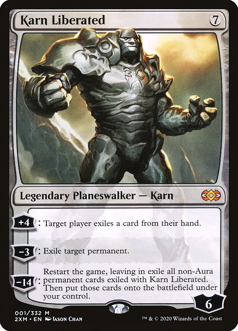
Magic: The Gathering isn’t just a game of numbers and combos; it’s a visual language. The moment Karn Liberated slides into view, you’re not just looking at a legendary planeswalker with a seven-mana cost—you’re reading a deliberate aesthetic message about neutrality, restraint, and the sheer force of consequence. Karn’s colorless frame—no color identity, no flashy identity to lean on—invites us to trust calculation over sentiment. In the color pie, colorless is the rarest of voices: calm authority, stark justice, and an obsession with order. 🧙♂️🔥💎
In MTG, color psychology often uses hue to cue mood: red for aggression, blue for control, green for growth, and so on. Karn refuses to wear a color badge, and that refusal speaks as loudly as any spoken line in the card’s text. The art, painted by Jason Chan for the Double Masters reprint, leans into reflective surfaces, chrome plating, and a pale, almost clinical glow. The palette—cool steel, graphite shadows, and a glimmering core—creates a visual sense of inevitability. It’s the art equivalent of a quiet, well-lit courtroom where every move is accounted for before it happens. The result is a mood that feels both ancient and machine-perfect, a perfect companion to Karn’s ability to reset the board and take control of the battlefield. 🎨⚔️
The colorless philosophy embodied in the composition
Colorless design is all about restraint and precision. Karn doesn’t rely on flashy color to convey power; instead, the artist leans on geometry, symmetry, and a subtle halo of light to imply an almost divine impartiality. That halo isn’t warm and inviting the way a sunlit gold or a lush green might be. It’s clinical, almost surgical—a nod to Karn’s origin as a construct built for rational problem-solving. This aesthetic choice mirrors the card’s text: Karn marches in with a plan that doesn’t bend to the whims of color factions. Its presence on the table signals a driver of tempo and strategy rather than raw elemental force. 🧠💎
From a lore perspective, Karn’s identity as a colorless, sentient artifact aligns with the idea of logic triumphing over emotion. In Double Masters’ reprint, the artwork reinforces that message: even in a world of sparks and mana, sometimes the most decisive tool is the one that sharpens the mind. The art’s cool tones and metallic finish echo the artifact-leaning flavor of Karn’s story, where memories, exiles, and resets are handled with cool calculation rather than flamboyant temperament. This is color psychology in motion: the absence of color can feel complete, and in Karn’s case, complete control. 🧙♂️🎲
How the text reinforces the art’s emotional pull
- +4: Exile from hand. A disruption that mirrors the cold, cutting logic of colorless design—deny an opponent options while you maintain your own calm center.
- −3: Exile target permanent. A precise removal that fits the art’s measured glow; nothing chaotic here—just a surgical strike against a threat.
- −14: Restart the game; claim exiled non-Aura permanents. The ultimate colorless reset. The sheer audacity of rebooting the entire board encapsulates the “impersonal” strength colorless aims to project. The art’s serenity underlines the fact that Karn’s power is immense, but it’s anchored in restraint, not fireworks. ⚔️
The visual and mechanical design dovetail beautifully in practical play too. Karn’s colorless identity makes it a flexible anchor for artifact-heavy and control-oriented decks, where the emphasis is on methods, not mana color. In formats where Karn is legal, your opponents feel the tremor of his +4 and −3 just as much as you feel the weight of his −14—only with Karn, you get to ride the wave back to your own advantage. This is color psychology as gameplay: emotionless efficiency can be just as intoxicating as a brightly colored wheel of fate. 🧙♂️💥
From art to deck: appreciating the design language
Jason Chan’s Karn Liberated not only communicates with a cool palette but also with composition that centers the figure in a serene, almost meditative space. The reflective surfaces pull the viewer’s gaze toward Karn’s core—a reminder that the planeswalker’s power comes from internal logic rather than external decoration. This alignment between what you see and what Karn does on the battlefield makes the card a satisfying study for players who love both aesthetics and strategy. The “mythic” rarity status in Double Masters underscores that this is more than a powerful card; it’s a centerpiece piece for collectors who savor the intersection of story, art, and mechanic design. The card’s iconic status is further buoyed by its continued relevance in formats where color identity isn’t a constraint, letting Karn’s colorless philosophy shine in a spectrum of possible builds. ✨
In terms of market pulse, Karn Liberated from this print run sits in a comfortable tier for modern-leaning collectors, with foil variants shining for those chasing that extra gleam of personality. While the price ebbs and flows with market trends, the art’s integrity and the card’s bold abilities keep Karn in conversations about the foundational colorless engines of the MTG universe. The EDH/Commander community often revisits Karn as a reliable engine for live-action board states where reset-and-reclaim plays tilt the outcome in your favor, a nod to the strategic psychology at the heart of modern colorless play. 💎🎲
Why this matters to you as a player and a collector
Great MTG art isn’t just decoration; it’s a doorway into how we think about cards, color, and control. Karn’s art communicates a philosophy: sometimes the most impactful actions are the quiet, measured ones that distill complex problems into clear solutions. This quiet confidence translates into the way you draft, sleeve, and plan your turns. When you see Karn on the battlefield, you’re reminded that the color pie is not the boss here—the mind behind the machine is. And if you’re chasing the full experience, the Double Masters printing captures that moment in time when the colorless path felt both inevitable and electrifying. 🧙♂️⚡
Meanwhile, if you’re shopping for a little extra magic outside the game table, consider treating yourself to a stylish desk companion that nods to the same vibe. The Gaming Neon Mouse Pad 9x7 Personalized Neoprene adds a splash of personal flair to your setup while keeping your mana sources clear and your mouse ready for quick, decisive decisions—because in MTG and life, a sharp edge and a steady hand win more than once. 🎨🧭