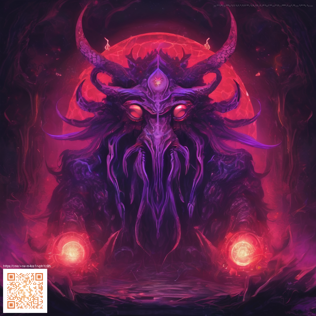
Using Paper Textures to Elevate UI/UX Concept Art
Texture is more than decoration. In UI/UX concept art, the subtle hint of paper fibers can ground digital interfaces in something tangible. By weaving paper textures into your mockups, you invite viewers to experience interfaces as if they were held in their hands. The result is a design language that feels tactile, approachable, and intentional—without sacrificing clarity or readability.
The language of grain, fiber, and surface
Paper textures carry a language all their own. A laid surface suggests structure and calm, while a wove texture conveys softness and nuance. Newsprint textures can lend a retro or editorial vibe, and handmade fibers add personality and warmth. When used thoughtfully, these textures create depth and contrast, helping essential UI elements pop while maintaining a cohesive aesthetic.
- Contrast without clutter: let a light paper texture provide background warmth before a high-contrast UI element appears on top.
- Hierarchy through texture: reserve dense textures for panels or cards and keep primary actions on cleaner, low-noise surfaces.
- Color dynamics: textures affect perceived color; calibrate your palette to ensure accessibility and legibility.
Practical steps for incorporating paper textures
Integrating texture into your workflow starts with a plan. Begin by collecting a small library of texture scans or vector-inspired textures that align with your brand. Then, translate those textures into UI assets with careful attention to scale, tiling, and lighting. A few actionable tips:
- Use texture as a backdrop for cards, modals, and panels to create depth without overwhelming content.
- Apply subtle displacement or overlay effects to simulate real surface interaction when users hover or press elements.
- Keep texture intensity variable across breakpoints so textures read well on mobile, tablet, and desktop.
“Texture should support readability and intent, not distract or overpower the message. When in doubt, scale back and let color and typography lead.”
For designers exploring this approach, a real-world touchpoint can be found in product ecosystems that pair physical and digital aesthetics. If you’re prototyping on hardware concepts, you might explore a Slim Lexan Phone Case for iPhone 16 Glossy Ultra-Slim to imagine how a glossy shell contrasts with matte paper textures in a dashboard or companion app. This kind of pairing helps you articulate a cohesive story: the materiality of the device meets the tactility of the interface.
Another source of inspiration is a curated gallery of texture-forward UI concepts. Designers often reference diverse visuals to understand how paper textures behave under motion and lighting. See how different surfaces interact with type, icons, and imagery in collections like the one hosted at https://diamond-images.zero-static.xyz/index.html. Even if the content isn’t identical to your project, the ideas about layering, shadow warmth, and texture scale transfer across domains.
Balancing texture with modern UI realities
Texture presence should feel intentional. In contemporary UI kits, texture often serves as a quiet backdrop that enhances contrasts between surfaces, rather than competing with content density. A well-placed texture can make a clean card feel alive, or give a modal a subtle weight that signals importance. In practical terms, aim for:
- Texture intensity that scales with the UI’s hierarchy.
- Consistent lighting cues that keep shadows predictable across components.
- Respect for accessibility; ensure text maintains sufficient contrast over textured areas.
As you iterate, document how your texture decisions affect user perception. Do they improve focus on primary actions, or do they introduce ambiguity? The goal is a unified, elegant language where paper-inspired surfaces complement color, typography, and motion rather than competing with them.
For teams, pairing digital assets with thoughtfully chosen textures can streamline collaboration. Share texture guidelines early, prototype with real content, and test across devices to ensure a cohesive experience. Remember, textures should enhance clarity and support brand storytelling rather than serve as mere ornamentation.