Image courtesy of Scryfall.com
Perspective Tricks in MTG Art: A Case Study of Vorpal Sword
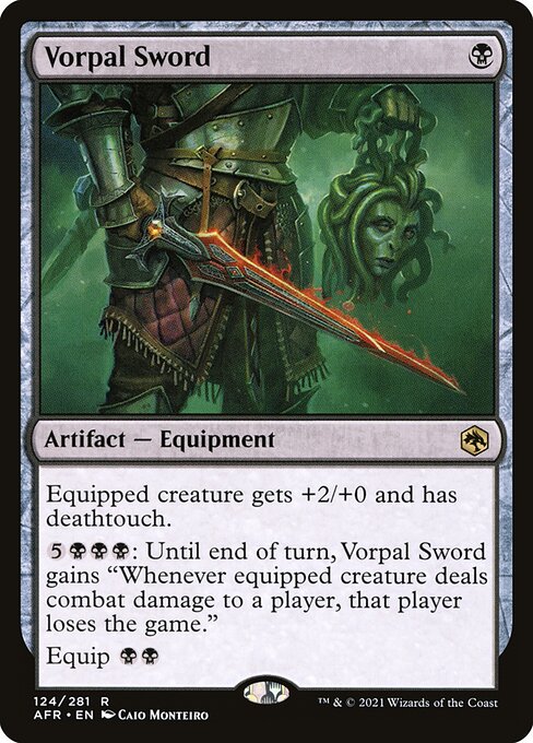
If you’ve ever flipped through a stack of MTG cards and found yourself tracing the lines from hilt to blade, you’ve felt the magic of perspective at work. Card art isn’t just pretty decoration; it’s a carefully choreographed window into a creature, a weapon, or a moment in a sprawling story. In Adventures in the Forgotten Realms—a set that blends high fantasy with dungeon-crawling vibes—the rare artifact Vorpal Sword offers an excellent lens on how perspective can amp up drama, imply power, and hint at what a card can do on the battlefield 🧙🔥💎⚔️. Let’s unpack how this piece uses vantage, lighting, and composition to pull you in and, just as importantly, how that artistry echoes the card’s mechanical identity.
The literal tilt: camera angle as character
In Vorpal Sword, the eye is drawn along the blade’s gleam, accentuated by a pronounced perspective line that hints at a drawn-first, struck-later moment. The weapon’s foreshortening creates a sense that the sword is slicing through space, not resting within the frame. That tilt isn’t just a flourish; it communicates the weapon’s deadly potential even before you read the text. The mind reads the blade as if it could spring forward, and that feeling pairs perfectly with the card’s deathtouch keyword—an abstract threat made tangible by a visual cue that says, “this is not a weapon to be trifled with.” The use of deep shadows along the spine of the blade reinforces that this is a black mana-driven instrument, all about precision, risk, and a certain elegant cruelty 🧙🔥⚔️.
Depth cues: leading lines, contrast, and negative space
Perspective in MTG art often relies on guiding lines—the edge of a blade, the tip of a pommel, or the angle of ruined architecture in the background. Vorpal Sword leverages these lines to lead the viewer’s eye toward the weapon’s tip, where danger culminates. The surrounding contrast, with dark tones leaning into the blade’s bright edge, creates a cinematic focus that makes the artifact feel heavy with consequence. In a game where many artifacts feel like mere stat sticks, this deliberate depth cues approach signals that Vorpal Sword isn’t just +2/+0 on a creature; it’s a moment where the battlefield can tilt in a heartbeat, especially given its later-game, mana-intensive clause that can turn a combat with a single, dramatic swing into a potential demolition of an opponent’s plan 🧙🔥🎲.
Lighting as mood: color identity and mechanical flavor
Color identity often governs how an art director approaches a card. Vorpal Sword is a black-mana artifact, and its lighting choices echo that identity: a cool, shadow-dominant palette with a sharp, almost surgical brightness along the blade. This contrast isn’t cosmetic; it mirrors the card’s flavorsome mechanics—high risk, high impact, and a whisper of necromantic precision. The effect—“Equipped creature gets +2/+0 and has deathtouch”—feels illustrated in the glare and edge-work, where the blade seems designed to deliver a kill precisely when the moment is right. It’s a small but telling alignment: the artwork’s mood foreshadows the card’s late-game swing in multiplayer formats like Commander, where a single equip swing can swing a game’s entire narrative 🧙🔥⚔️.
An artist’s note: Caio Monteiro’s touch
Caio Monteiro’s illustration gifts the sword with a tactile, almost tangible menace. The perspective work invites you to step into a dungeon corridor where danger lurks in the foreground and strategy waits in the wings. This is the kind of piece that rewards close study: the blade’s geometry, the texture of aged metal, the way light curls along the edge—all of it speaks to a seasoned hand thinking about how a viewer’s eye travels across a 2D plane and lands squarely on a 3D-feeling threat. For players and collectors, that level of craft is a reminder that fantasy art still thrives on the old tricks—perspective that makes you lean in, and details that reward repeated viewing 🎨💎.
“In MTG art, perspective is the quiet engine behind the loudest moments. The eye doesn’t just see a weapon; it feels the moment before impact—the breath held, the decision made, the land turned.”
How this piece informs gameplay and deck-building choices
Vorpal Sword’s text invites you to think about tempo, risk, and resource management. With a mana cost of {B} and an Equip cost of {B}{B}, it slides into black-centered strategies that lean on removal, protection, and the inevitability of a late-game edge. The equipped creature gains deathtouch, turning even a modest frame into a potential game-ender when paired with evasive or pump options. The burst clause, “{5}{B}{B}{B}: Until end of turn, this Equipment gains ‘Whenever equipped creature deals combat damage to a player, that player loses the game,’” is the kind of spicy, swingy line that art sells with a single glance. The art’s perspective underscores this: the moment is now, the threat is real, and the blade might already be slicing through the narrative as you decide whether to commit the equip or wait for a better moment ⚔️🧙🔥.
In terms of deck construction, think about disruption and board presence. Black decks that can protect the equipped creature—whether with graveyard recursion, tutoring, or targeted removal—will maximize Vorpal Sword’s effectiveness. The artwork’s dynamic perspective also nudges you toward thinking about commanders who pair well with equipment and deathtouch enablers; it’s a design prompt that nudges players to imagine how the blade could tilt a game when wielded by a powerful legendary creature or a resilient attacker in multiplayer formats. The piece’s sense of depth invites you to imagine layers of interaction: the blade passing through light, the threat behind it, and the immediate choice of whether to curb or unleash its power on the turn you draw the Equip cost ⚔️🎲.
Collectibility, artistry, and community discourse
As a rare artifact from the AFR set, Vorpal Sword sits inside a meaningful space for collectors who track rarity, foil variability, and the enduring value of artful design. The card’s high-res illustration, combined with a bold and unmistakable silhouette, makes it a strong piece for showing off in a binder or display case. Beyond investment considerations, the discussion around perspective in MTG art—how a certain angle, shadow, or glow can change a card’s perceived power—fuels conversations across forums, artist spotlights, and local game stores. The historical thread—how an ancient term like “vorpal” from classic fantasy literature collides with modern card design—gives fans a shared vocabulary for celebrating both lore and technique 🧙🔥💎.
For players who love the tactile thrill of a well-constructed artifact deck, Vorpal Sword is an emblem of the synergy between form and function: a blade that looks ready to slice through a strategic knot as deftly as it envisions its next kill. And for those who savor the broader Magic multiverse, it’s a reminder that even a single card can be a masterclass in composition, perspective, and the storytelling power of color and light 🎨⚔️.
If you’re exploring the broader universe of MTG art and want a tangy crossover moment that pairs gameplay insight with a collector’s eye, you can also check out related gear and goodies to accompany your battles. And while you’re planning your next play night, consider adding a little real-world magic to your setup with a handy gadget—the perfect blend of craftsmanship and utility—just a click away: