Image courtesy of Scryfall.com
Iconic Art in Blinding Powder: Design, Theme, and the Moment It Captures 🧙♂️🔥
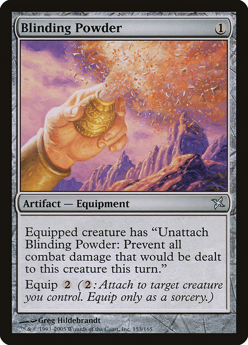
Magic: The Gathering has always told stories not just through words and rules but through a gallery of images that become shorthand for possibilities players lean into over countless games. Some cards stay in memory because their art speaks with economy and boldness—an instant read that makes you pause, lean in, and picture the moment it represents. Blinding Powder is one such piece. A modest one-mana artifact from Betrayers of Kamigawa, it carries a quiet bravado that transcends its statistics and finds a place in many fans’ mental top shelves. The image whispers a tale of alchemy, caution, and the sly elegance of protection on the battlefield. 🧙♂️🎨
Released in 2005 as part of the Kamigawa block, this colorless Equipment carries that signature “tool-of-the-trade” vibe: a simple, almost conspiratorial object that becomes a lifeline for a cared-for creature. The card’s mana cost is {1}, and its rarity is uncommon, a position that often rewards informed players who scout for practical upgrades that fit into any colorless or artifact-heavy deck. The art, created by Greg Hildebrandt, leans into a classic fantasy-clean aesthetic—bold lines, luminous highlights, and a sense of weight that invites you to reach out and grab the powder yourself. The result is a piece that looks good on a sleeve, a binder, or a wall above your desk as a reminder of the moment you chose defense over offense. 💎⚔️
What makes the art feel iconic? 5 design cues to notice
- Clarity of concept: The object at the center is unadorned but potent. In a game where the text can run long, the equipment form communicates function at a glance.
- Silhouette that reads in a thumbnail: The powder device has a compact, recognizable shape that remains legible when sized down for card previews and tournament mats—an essential trait for iconic art. 🧭
- Contrast and lighting: Hildebrandt’s use of gleam and shadow gives the powder a sense of value and danger, like a tiny lantern in a shadowed workshop.
- Flavor through mechanics: The art reflects the card’s flavor and play pattern—the powder is a tool that protects its user by negating incoming damage for a turn, a quiet shield in a world of loud spells.
- Artifact identity: As an Equipment, the card foregrounds objects over personified characters, reinforcing a flavor of craft, invention, and practical magic that resonates with players who love techy, gadgety vibes. 🧰
“Iconic art doesn’t need to shout to stay loud in memory; it speaks with a single well-chosen image that echoes through rulebooks and sleeves alike.”
Context from the Betrayers of Kamigawa era
Betrayers of Kamigawa blends the ornate, kami-infused style of Kamigawa with a modern, gadget-friendly edge. Blinding Powder sits squarely in that space: a colorless artifact that can be attached to a creature to grant a protective buffer—“Unattach Blinding Powder: Prevent all combat damage that would be dealt to this creature this turn.” Equip {2} completes the cycle, turning a simple device into a reliable shield. The combination of a straightforward mechanical effect with a clean, striking image is what makes the art feel timeless. The symbolism—light, glare, and an almost surgical tool—speaks to both the arcane and the engineered, a duality that fans often cite when discussing iconic Kamigawa visuals. 🔥🎯
The artist, Greg Hildebrandt, brings a legacy of classic fantasy illustration to this card. His bold outlines and confident shading give the powder a tangible presence that feels almost tactile—a rarity in a world of broad, painterly fantasy. That tactile sense invites players to imagine turning the device over, testing the moment when its protective magic activates, and savoring the calm it brings in the heat of a battlefield exchange. The result is a design that behaves well in both casual and competitive contexts, which helps it endure as a beloved piece among collectors and players alike. 🎨🔎
Gameplay resonance: art reinforcing function
The visual message mirrors how you might use this card in a game. The powder’s aura of safety aligns with the mechanic’s intent: you shield a trusted attacker’s advance for a turn, buying time and protecting your threats from damage that could swing the game’s momentum. The artwork subtly suggests not overpowering drama but calculated defense—a vibe that resonates with players who value tempo and protection as part of a balanced game plan. This is art that teaches you a strategy by mood as much as by text, a hallmark of memorable card design. 🧙♂️💡
Impact on collecting and cultural memory
Blinding Powder’s rarity—uncommon—places it within reach for many collectors while still feeling like a standout. Its value isn’t about chasing the most expensive chase rare; it’s about owning a piece that embodies a specific era’s aesthetic and a clean, readable mechanic. Current price hints from card trackers show modest foil premium and a more accessible non-foil price, reinforcing its role as a "worthy centerpiece" for a midrange or artifact-themed collection. The combination of a strong artist’s signature, role in a beloved Kamigawa block, and a crisp, iconic silhouette makes it a candidate for long-term admiration among art-focused collectors. 💎⚔️
As we celebrate the art that endures, it’s fun to pair MTG nostalgia with a tangible desk upgrade—because a gaming session deserves the right gear. If you’re browsing a few upgrades for your battle station, consider blending your love of the multiverse with something practical and stylish. This particular product pairing channels the same spirit as the card: dependable, a touch clever, and built for long-term use. 🧙♂️🎲
Ready to level up your setup and your play? Check out the Gaming Neon Mouse Pad 9x7 Personalized Neoprene to keep your desk as ready for action as your deck is. It’s a small-but-satisfying way to celebrate the rhythm of late-night games and early morning deck-building sessions alike.