Image courtesy of Scryfall.com
Magical art has a way of freezing a moment in time, turning a handful of pixels into a memory you carry to the kitchen table, the store shelf, or the digital casual table where MTG chatter roams. When we talk about what makes some card art instantly iconic, we’re really chasing a blend of narrative punch, visual clarity, and a dash of spectacle that survives the test of format, age, and art direction. Close Quarters—the red enchantment from Mercadian Masques—offers a perfect case study in how a single illustration can transcend its stats to become a shorthand for a moment in the game’s culture 🧙♂️🔥.
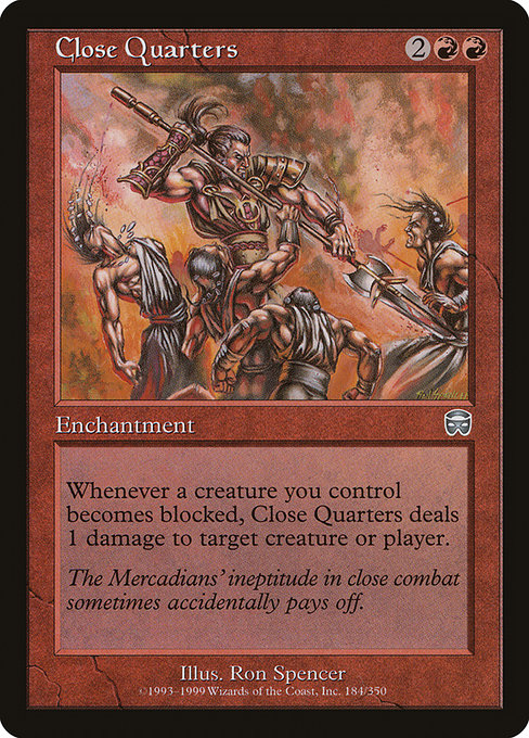
Mercadian Masques as a Canvas for Iconic Imagery
Released in 1999 as part of the Mercadian Masques block, Close Quarters sits in the red color pie, with a mana cost of 2RR and an uncommon rarity. The set itself was a pivot toward a more grounded, political-flavored MACRO-sandbox of Ravnica-like intrigue before that kind of complexity clogged modern cards. In this environment, art had to carry the emotional load: quick, legible, and explosive. Ron Spencer, the artist behind the piece, delivered a scene that feels both immediate and personal—the kind of image you can point to and say, “That’s red in its wheelhouse: fast, aggressive, and a little reckless.” The frame and the era give the art a certain tactile warmth that still reads clearly on a sleeve or a monitor decades later 🎨.
Close Quarters isn’t just a pretty picture; it’s a narrative beat rendered in oils and ink. The card’s flavor text—“The Mercadians’ ineptitude in close combat sometimes accidentally pays off”—tilts the artwork toward humor as well as menace. That wink helps anchor the image in a storytelling tradition that MTG fans adore: the idea that even bungled attempts can stumble into dramatic outcomes, a beat that mirrors how the card’s ability can turn a grind into a small, blazing victory ⚔️.
The Artist’s Hand and the Red Aesthetic
Ron Spencer’s artistry has a bold, pragmatic energy. In Close Quarters, the color palette leans hot and urgent—crimson highlights slicing through darker shades, figures caught in a moment of kinetic collision. The result is legible at a distance and compelling up close: you feel the pressure of combat, the friction of steel, and the bright flare of magic colliding with brute force. That clarity is a huge factor in iconic art: you don’t need to zoom in to understand what’s happening, and you’re drawn in by the action rather than overwhelmed by it. It’s the kind of art that looks great on a card belt, a poster, or a digital screen, which helps it cross into the cultural memory beyond just a casual reading of the card text 🧱🔥.
Visual Language That Sticks
- Immediate action: The moment of conflict is compressed into a single, dynamic tableau. The eye follows motion from the attacker’s reach to the defender’s reactive posture, then out to the magic edge implied by the glow—a design choice that communicates risk and reward in one glance 🧭.
- Color as cue: Red isn’t just a mana color here; it’s a cue for speed, heat, and danger. The hot palette signals aggression and a blasty-punch payoff, which aligns with red’s flavor in many sets: pressure, tempo, and the thrill of an explosive swing ⚡️.
- Typography and readability: In the late 1990s, art needed to work with a variety of card frames. The image retains clarity even when scaled down for a sleeve or a mobile screen, ensuring the story remains legible even at smaller sizes 🎯.
“The Mercadians’ ineptitude in close combat sometimes accidentally pays off.”
That tiny flavor text nugget is a reminder that iconic art isn’t just about the moment on the page; it’s about the mood the moment conveys. The art supports the flavor, the flavor supports the gameplay, and the whole package rewards familiarity with a wink—a perfect recipe for a piece that endures in memory even as new cards join the fray 🧙♂️💎.
Gameplay Resonance and the Visual Narrative
Close Quarters is more than a style exercise; it’s a symbol of red’s frontier in combat. The enchantment’s ability—“Whenever a creature you control becomes blocked, this enchantment deals 1 damage to any target”—is a crisp, tempo-driven mechanic that rewards pressure and aggression. In practice, the card invites players to push into tough combat, forcing blockers into the open or punishing a standstill with a precise burn. The artwork reflects that tension: you can almost hear the clash in the imagery—the clang of steel, the crackle of magic, the sudden flare of retaliatory damage. It’s a small moment that captures a big idea about red’s approach to warfare: offense through bold, close-quarters maneuvering 🗡️🔥.
Collectors and players alike appreciate how these elements echo each other. The visual emphasis on proximity and danger pairs with a gameplay mechanic that rewards decisiveness. The “blocked” moment, visually dramatic in the painting, becomes a strategic focal point when you translate it to a table, where every engagement could tilt the outcome one way or the other. It’s a texture card, where the image and text braid into a singular experience rather than two separate pieces of information 🎲.
Iconic Art and Collector Culture
Uncommon cards like Close Quarters often become favorites not just for playability but for the story they tell about the era and the artists who defined it. The card’s listing in Mercadian Masques, its foil vs. nonfoil finishes, and its status within collectors’ catalogs contribute to its enduring profile. In the broader MTG tapestry, a piece like this becomes a gateway for new players to discover a specific moment in magic history—the late-90s era of aggressive tempo decks and bold fantasy illustration. It’s not merely a card; it’s a bookmark in the sport’s art history, a slab of memory that fans show with pride on social feeds and at local game nights 🧙♂️🎨.
For enthusiasts who enjoy connecting the art to the hobby’s tangible gear, the pairing of timeless visuals with practical goods—from card sleeves to high-quality playmats—is a natural fit. The image’s fiery energy translates well into modern accessories and display pieces, inviting collectors to curate a mini-archive of what art means to them as players and fans.
A Small Nudge Toward Tomorrow’s Classics
Iconic MTG art often travels along a line—from the moment of release to the memory of a fan, to the reprint, and, sometimes, to a modern reinterpretation. Close Quarters captures a sweet spot: the raw energy of a single moment, the crisp simplicity of the mechanic it accompanies, and a painterly style that still feels bold. It’s a reminder that art can be a star player in a card’s identity—one that invites new players to ask not only, “What does this card do?” but also, “What stories does this image tell me about the game I love 🧙♂️💎⚔️.”
For those who want to keep the MTG conversation going beyond the table, this card serves as a perfect example to illustrate design philosophy in the late 1990s and how a single illustration can anchor a card’s reputation for years to come. The lore, the layout, and the lively color work together to produce a lasting impression that’s familiar to veterans and irresistibly discoverable for newcomers 🎲.